design identity

goal: to create the identity that communicates brand’s values and attracts TARGET clients
SMART decision making
willing to experiment
The dual visual nature that combines the rebellious spirit and intellectual approach of Lepekhin studio: a play of contrasts of sharp shapes with bright colors and simple forms with soothing hues.

logo and typography

Serifs in the selected typeface provide intelligent vibes, whereas the proportions of letters create bold look.

The logo is based on these features of the type, though has more display and condensed appearance.

Local
Cyrillic short
local Cyrillic
International lATIN short
International LATIN
color palette and graphics

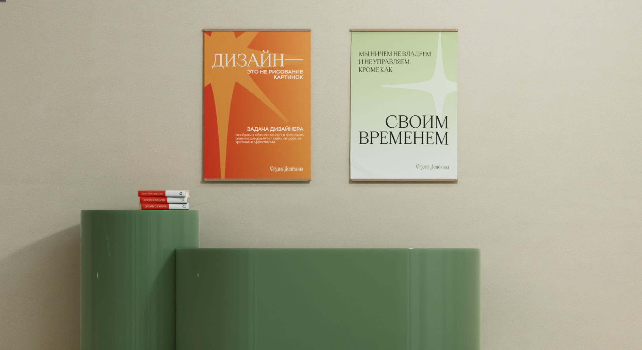
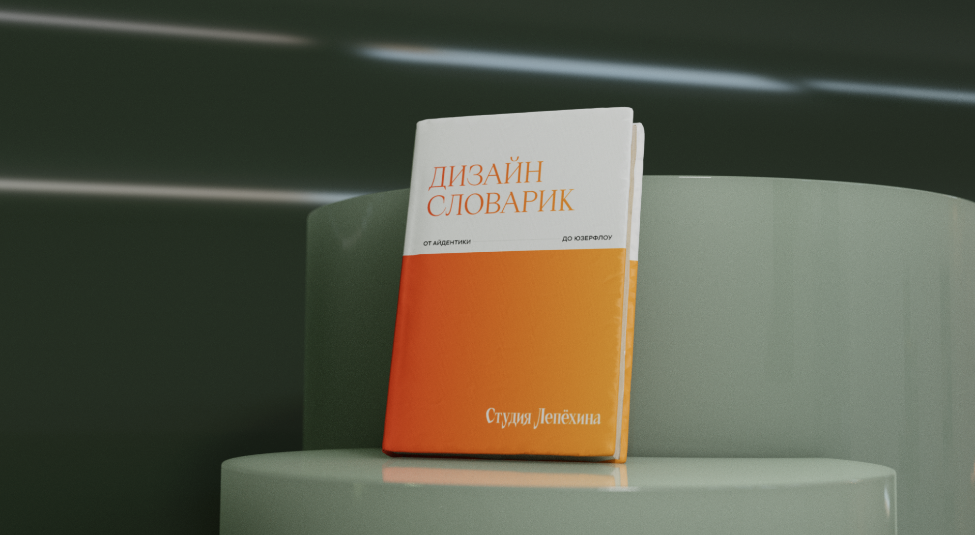
The color palette is composed of contrasting colors to reflect the dualism of the studio's calm professionalism and rebellious boldness. Together, orange and green colors are reminiscent of autumn, the time when nature is quiet but bright.

Graphics repeat the font and logo aesthetics. It allows to set up the rhythm through the identity mediums, whatever elements they contain.
implementation in web
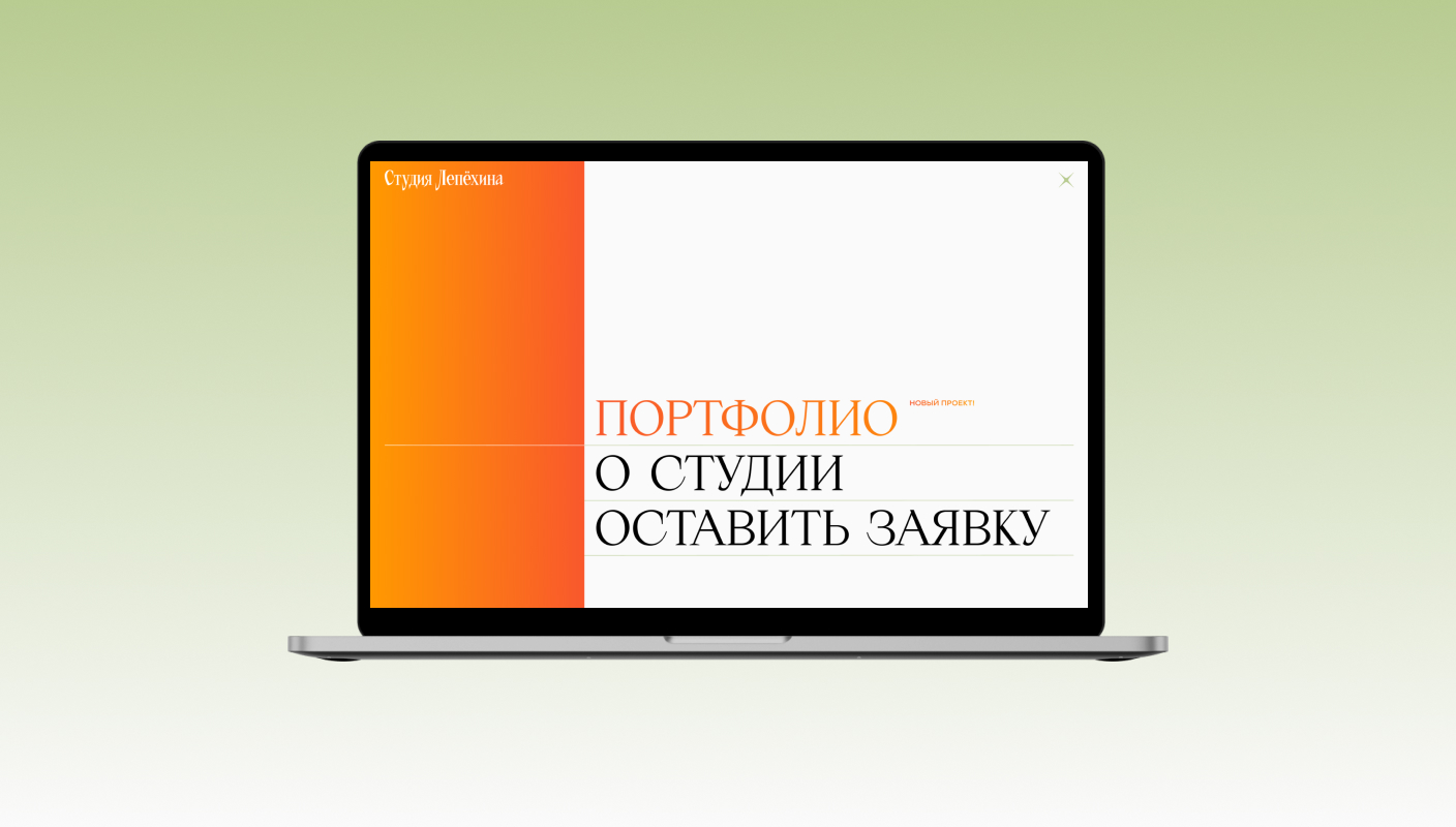
contrast in layout, typography, colors
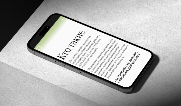
The concept of the identity is fully reflected through the website:
  • High-contrast fonts in style and size: delicate grotesque + sharp serif.
  • Stories told via minimalist texts followed by glossy gradient blocks.
  • Graphic elements support type aesthetics and highlight bright nature of gradients embodying sharp ideas of the studio.